Own productClothing brand store

The White Sigil

A clothing brand that looks like a fashion house.

An online store for a clothing brand whose collections are made to order and reach buyers worldwide. Designed and written from scratch so that every screen looks like a magazine cover, not a shop page.

Type
Own product
Role
Design, code and launch
Scope
Store, collections, brand page, cart
Year
2026
Stack
Next.js
The site in motion, recorded without editing.

Starting point

Clothes with an idea do not sell on a photo of clothes.

The White Sigil is a brand built around discipline and self-mastery, and its only showroom is its website. So the site had to do what a good boutique does: draw you into the brand's world first and show the price tag second. Every screen was designed so the buyer feels they are buying a mark, not a print.

What the site had to do

  • The first screen says what the brand believes in
  • Each collection has a world and a character of its own
  • A buyer in any country knows when and how the order arrives

The decisions,one by one.

The White Sigil: The word and the figure in one frame

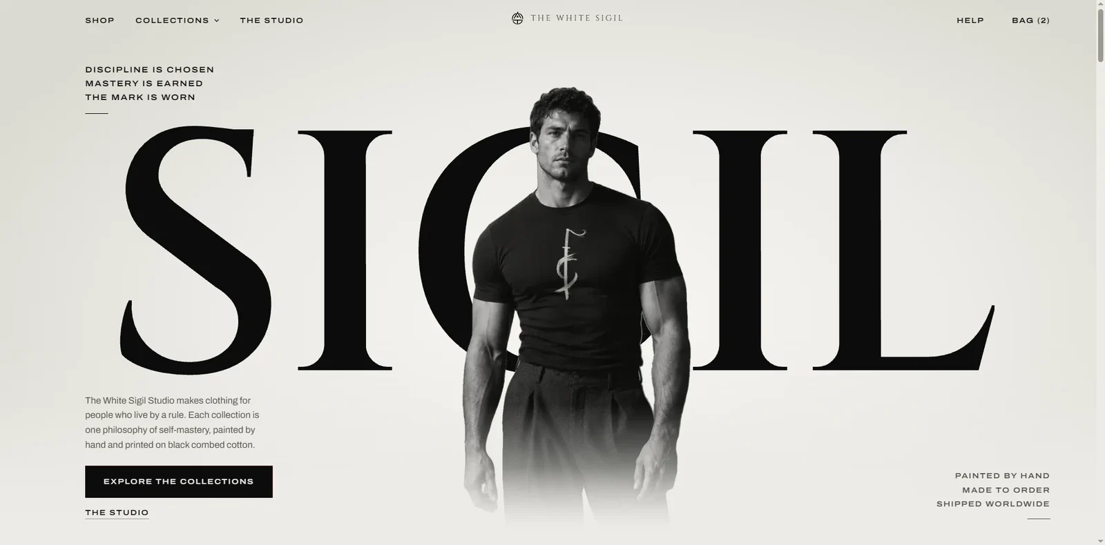
The word and the figure in one frame

The first screen works like a cover. The word "SIGIL" takes the full width and the figure stands between the letters: part of the lettering is in front, part behind. A frame like this needs the photograph and the type composed layer by layer, which is why it cannot be mistaken for any template.

  • The figure woven between the letters
  • Three lines of manifesto instead of a slogan
  • A single button leading to the collections
The White Sigil: A collection as a chapter, not a category

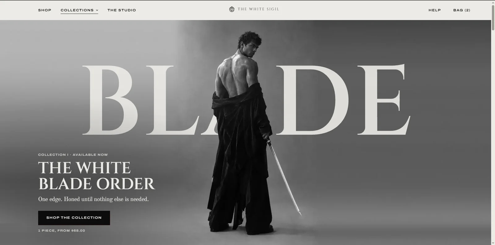
A collection as a chapter, not a category

Each collection gets its own word, its own figure and one sentence that defines it. You enter them like chapters of one story: the same rigour of composition, a different mood each time. Collections in preparation stand beside the available ones, so from the first visit the brand shows its whole world.

  • Its own frame and name for each collection
  • The range of the collection and prices right under the button
  • Upcoming collections in the same layout
The White Sigil: The product page answers before the buyer asks

The product page answers before the buyer asks

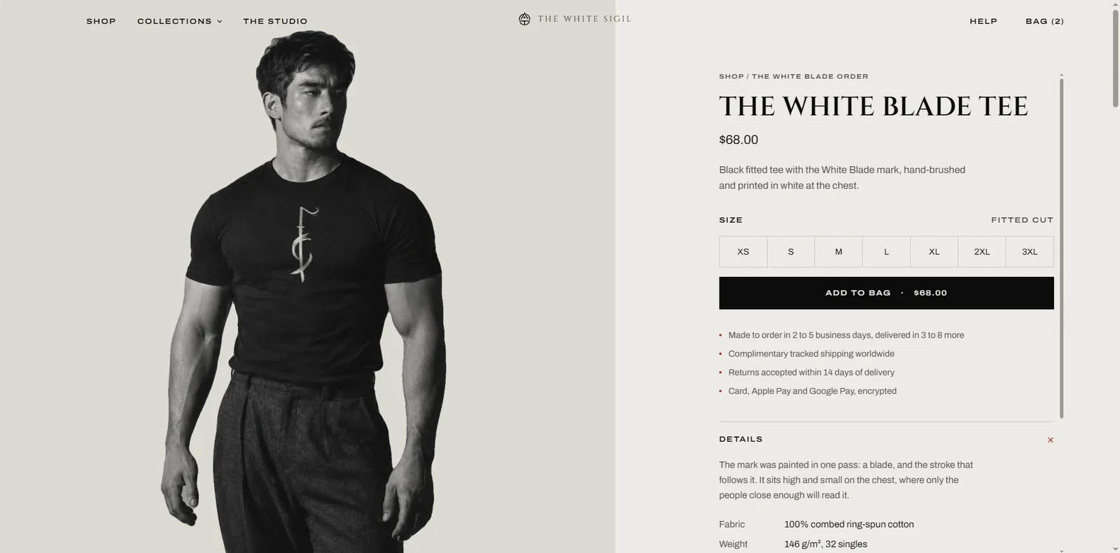
The product pages combine two things that rarely go together: a half-screen photograph and a full set of facts. Next to the button are the four answers a buyer in any country looks for: how long it takes to make, what shipping costs, how to return and how to pay. Nothing distracts and nothing has to be searched for.

  • Production and delivery time stated in days
  • Sizes from XS to 3XL in a single row
  • Fabric composition and weight without leaving the page
The White Sigil: The brand has a place of its own

The brand has a place of its own

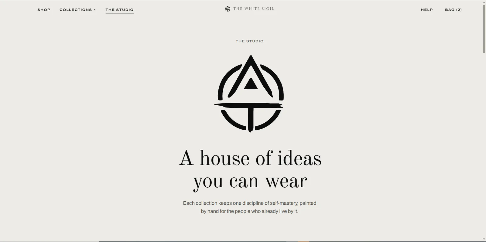
A separate page, "The Studio", tells where the marks come from and how the clothes are made: painted by hand, printed to order, boxed and sent. This is where the brand stops being a logo and becomes a workshop with its own craft and rules.

  • The brand mark as the main image of the page
  • The making process described step by step
  • The most common questions gathered before the cart

Under the bonnet,the part nobody sees.

Code
Next.js, written from scratch, no template
Payments
Card, Apple Pay, Google Pay
Sales
Made to order, shipped worldwide
Languages
English

Your projectgets the same treatment.

Every decision on this page has a reason behind it. Yours will too: tell us what you need and you will get a concrete answer within one working day.

The data you send is used only to answer your enquiry. The controller is Rectra Solutions; you can have it deleted at any time by writing to rectrasolutions@gmail.com.