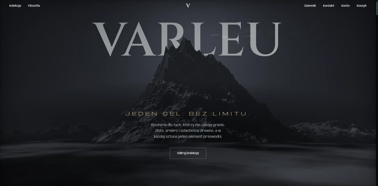
One frame instead of a product grid
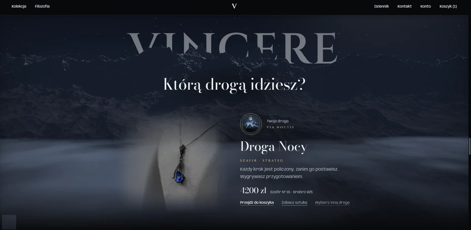
The store opens with a photograph, not an offer. The brand name is woven into the frame: some of the letters sit behind the mountain peak, so the lettering and the photograph read as one piece.
- The brand name layered into the photograph
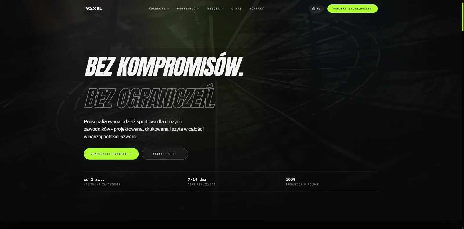
- A single call to action on the screen
- A menu kept to six items